At CliqAlly, we believe every website should be usable by everyone. That’s why we created a simple yet powerful tool: the CliqAlly Contrast Checker—built to help designers, developers, and business owners ensure their color choices are readable, inclusive, and compliant.
Why Color Contrast Matters
Color contrast plays a huge role in how users experience your website.
If your text blends into the background, users may struggle to read your content—especially those with visual impairments or color blindness. In fact, poor contrast is one of the most common accessibility issues found on websites.
According to WCAG guidelines:
- Normal text should have at least a 4.5:1 contrast ratio
- Large text should have at least a 3:1 contrast ratio
Failing to meet these standards doesn’t just affect accessibility—it can also impact user experience, engagement, and even conversions.
What is the CliqAlly Contrast Checker?
The CliqAlly Contrast Checker is a free online tool that lets you instantly test color combinations for accessibility.
Simply choose your text color and background color, and the tool will:
- Calculate the contrast ratio
- Show whether it passes or fails
- Evaluate both WCAG AA and AAA standards
- Provide results for normal text and large text
No complicated setup. No guesswork. Just clear results.
Built for Simplicity and Speed
Many contrast tools exist, but we focused on making ours:
- Beginner-friendly – anyone can use it, even non-designers
- Fast and intuitive – instant feedback as you adjust colors
- Practical – designed for real-world use during design and development
Instead of digging through guidelines or doing manual calculations, you get immediate answers—so you can make better design decisions faster.
Who Should Use This Tool?
The CliqAlly Contrast Checker is useful for:
Designers
Validate your color palettes before finalizing designs.
Developers
Ensure your UI meets accessibility standards during development.
Business Owners
Check if your website is readable and inclusive for all users.
Content Creators
Make sure your visuals and text are easy to consume across devices.
Why This Tool Matters for Inclusivity
Accessibility isn’t just a technical requirement—it’s a responsibility.
Millions of users experience low vision, color blindness, or other visual challenges. Proper contrast ensures they can:
- Read your content clearly
- Navigate your website
- Engage with your brand without barriers
Better contrast doesn’t just help users with disabilities—it improves readability for everyone, especially in bright environments or on mobile screens.
More Than Compliance—It’s Better UX
While meeting WCAG standards is important for legal compliance, the real value goes beyond that.
Good contrast leads to:
- Better readability
- Lower bounce rates
- Higher engagement
- Improved user trust
In short: accessible design is good design.
How to Use the CliqAlly Contrast Checker
Using the CliqAlly Contrast Checker is simple and interactive—you don’t need any technical knowledge to get started.
Here’s how you can make the most out of it:
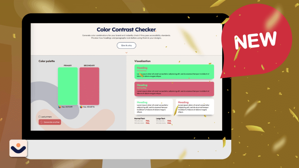
1. Generate Your Colors
Start by generating two colors:
- Primary color (usually your text color)
- Secondary color (your background)
You can either manually pick colors or let the tool generate combinations for you instantly.
2. Preview in Real-Time
As soon as your colors are selected, you’ll see text samples in the visualization column.
This gives you a real-world preview of how your content will look—not just numbers, but actual readability.
3. Lock a Color You Like
Found a primary color you want to keep?
You can lock the primary color and continue generating different secondary colors. This is perfect if:
- You already have a brand color
- You want to explore safe background combinations
4. Generate Better Matches
Keep generating until you find a combination that looks good and passes accessibility standards.
This removes the guesswork and helps you discover combinations you might not have considered.
5. Check Accessibility Results
For every combination, the tool automatically shows:
- Pass or Fail
- WCAG AA and AAA compliance
- Results for both:
- Normal text
- Large text
Try It Yourself
Ready to test your colors? Visit the CliqAlly Contrast Checker and start building more accessible designs today.
Get in touch with us today and let’s build a website that works as hard as you do.